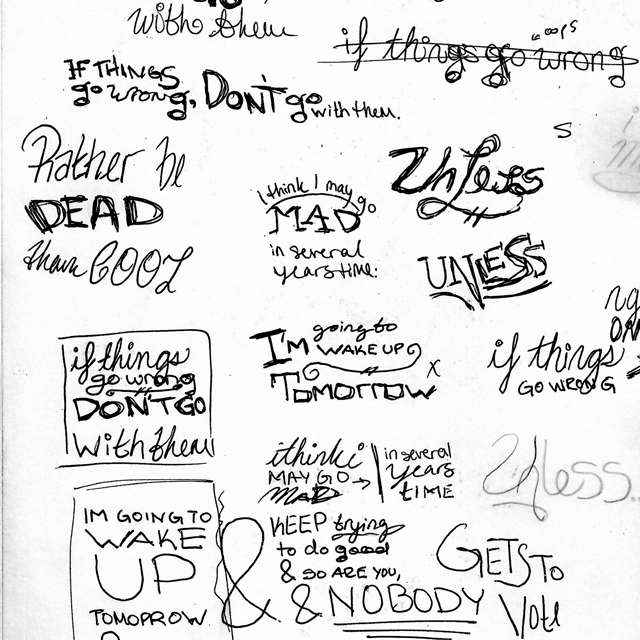
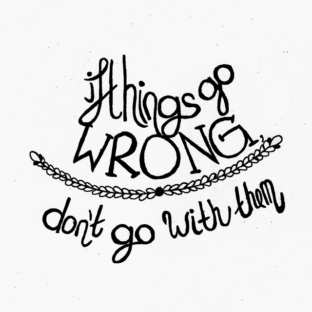
For my final design philosophy piece, I chose the phrase "if things go wrong, don't go with them" because in any given project, there's bound to be something that doesn't go exactly as planned, but there's always something you can do to help! You might just have to take a breath and a step back first.
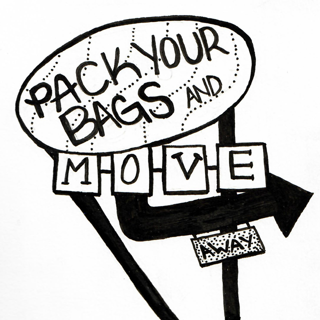
For the piece centered around anger, I chose to work with the phrase "pack your bags and move away." While escapism probably isn't the healthiest response to anger, it's a much better alternative than the argumentative equivalent of an explosion. Choosing to theme this piece around that idea of escaping, combined with my love of vintage and vintage-inspired type, I landed on a motel sign.
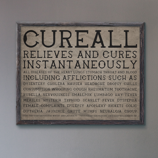
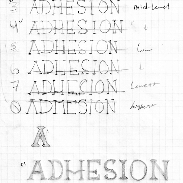
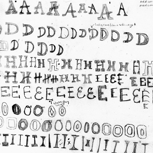
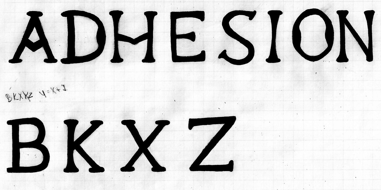
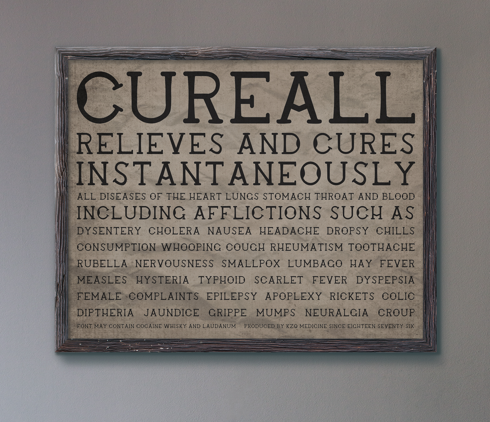
As mentioned before, the type project is based off of the American wood block type of the patent medicine era. I love the uniqueness of having a standard set that was still dependant on human ability, so I did my best to capture that not quite perfect, very human feel that comes with the type of the era. I also want to mention that yes, the " misspelling" of whisky instead of whiskey is intentional, I found in my research for this project that it was an alternate spelling during the patent medicine era (though it's actually still in use today as well!)
If you'd like to download Cureall for yourself, you can do so with the button below. I will mention that it currently doesn't have lowercase letters, punctuation, or numbers though.
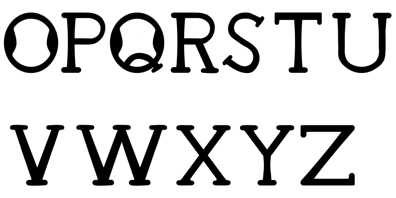
I really like type in general, but there's something kind of special about how self contained pieces of hand drawn type tend to be. In a world where it can be hard to decide when art is "done," in my opinion this kind of work often makes it very clear. I also think things like creating the Cureall helped me learn how to better refine hand drawn pieces without loosing what makes them unique.